The Striped Phoenix
Role: Freelance Designer & Art Director
Duration: 2 Months
Tools: Illustrator, InDesign, Squarespace
A client requested The Striped Phoenix to rebrand her American Sign Language interpreting agency. She wanted the new branding to represent her more and memorable at the same time. In this project, I was the logo designer and art director of the print materials and website.
She requested the representation of the ASL hand signs "Touch," then "Finish," which is the English equivalent to "been there," - the reason being the client travels the world for leisure, having been to (or "touch-finish") many international cities. She requested that represented in her new logo.
Brainstorming
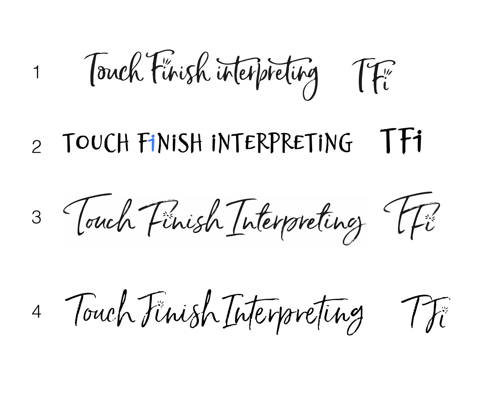
We have had several variations of the logo which range from a simple abbreviation to playful cursive to a small person.
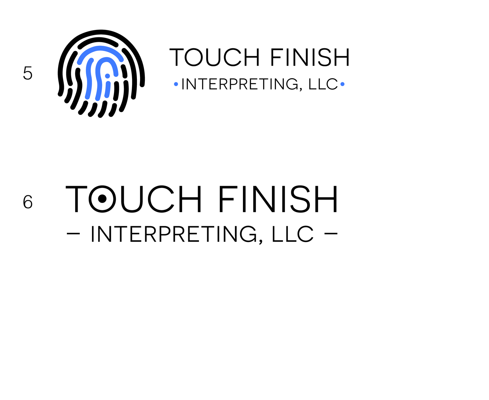
After many drafts, the client chose the version with the fingerprint because the ASL sign for "touch" appears using a finger to touch the back of the opposing hand. The abbreviation, TFi, can be seen in the center of the fingerprint.
Logo Implementation
+ Art Direction
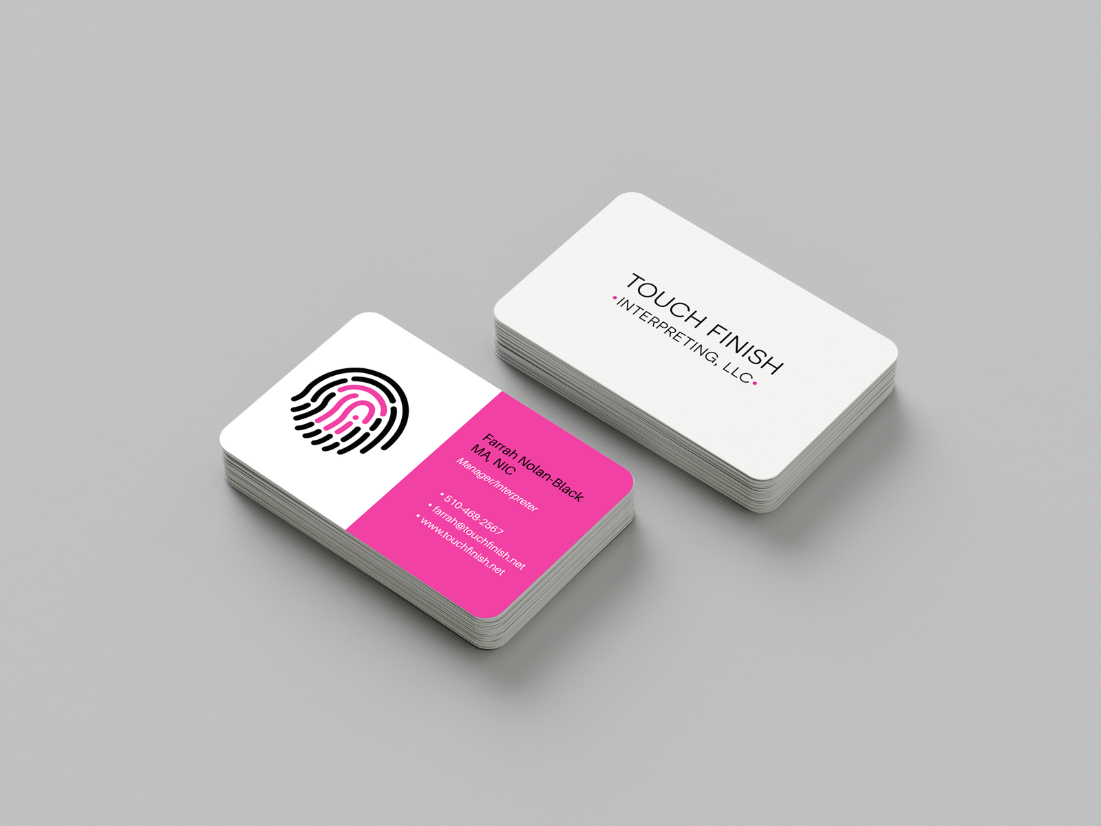
A business card is also requested, and we worked with different versions. Since the logo itself is dynamic, the business card would need to stay simple and subtle.
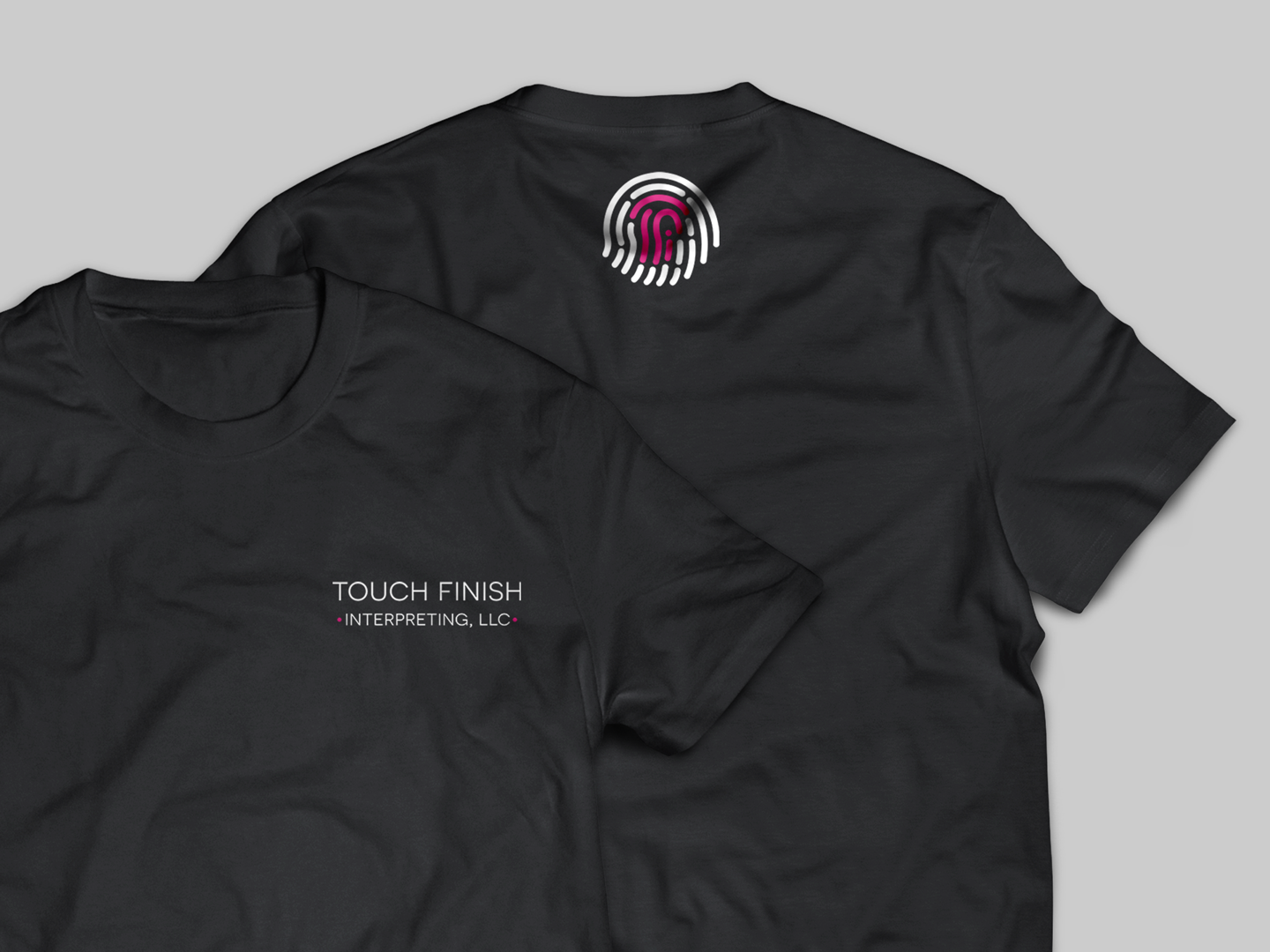
We then added it to a black t-shirt so the client then can wear it to her assignments. That way those who hire her for interpreting, as well as the person who needs ASL interpreting services, will recognize her as the interpreter when she shows up in person.
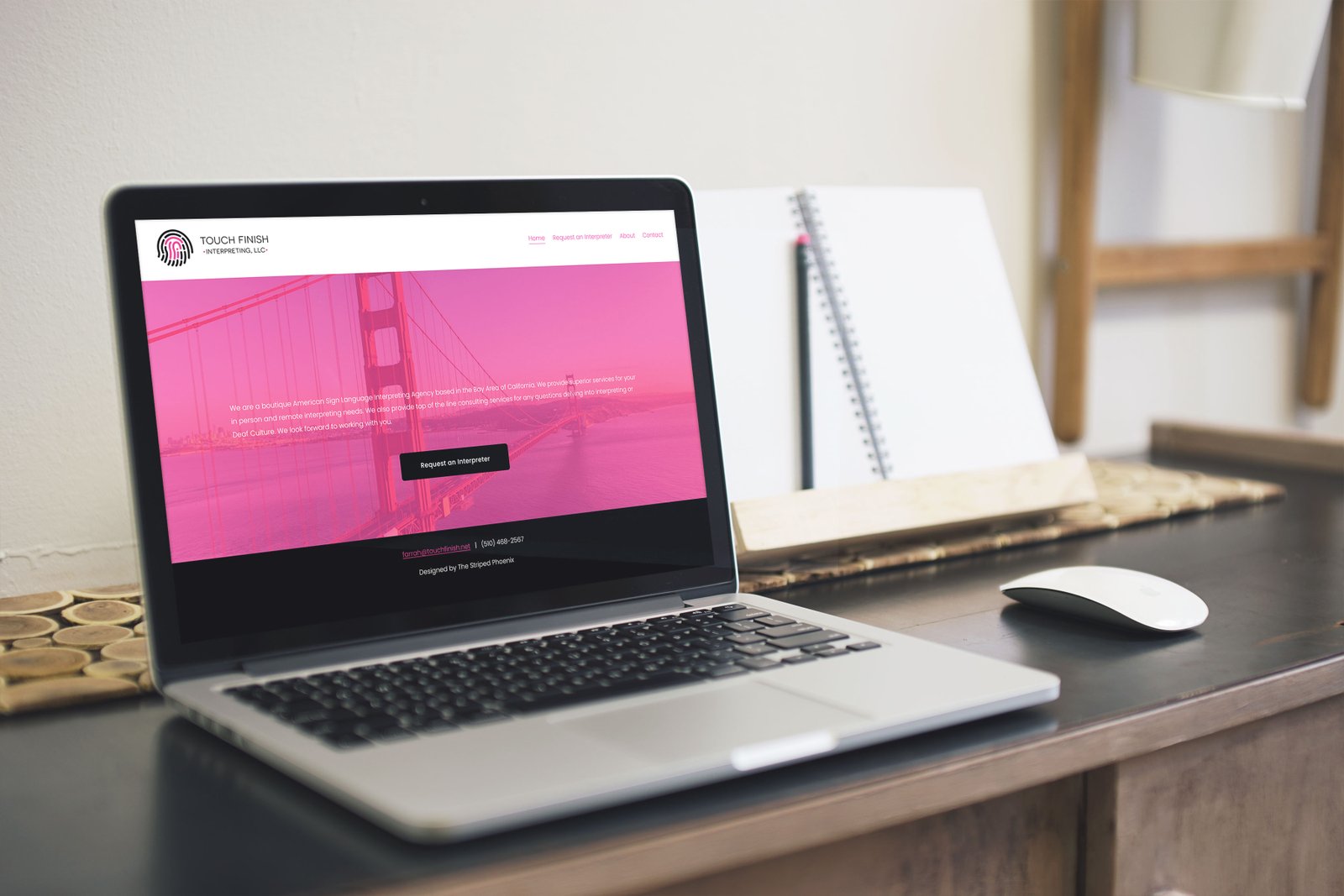
A website is developed for the client's interpreting business so that her clients can request her services online as well as creating an online presence.
Overview
We have a motto that we always use is to "keep it simple" - and it pays off how it came out well in print and digital.
We also enjoyed how the logo is designed to be versatile across different mediums. The logotype by itself has much of an impact in communicating the brand as much as the logo.