Google Glass
In the early 2010s, Google has experimented with Project Glass, which may begin the wearable tech boom. It was meant for everyone who adores tech to use, and while it was groundbreaking at the time, it never caught on. It instead becomes a new hands-free tool for business or industrial use.
I see it as an opportunity for it to be used towards a more specific audience, the deaf and hard-of-hearing community. The UX/UI case study is to identify the needs of the deaf or hard-of-hearing person and create a user map to help the user to enable captioning and other assistive tools.
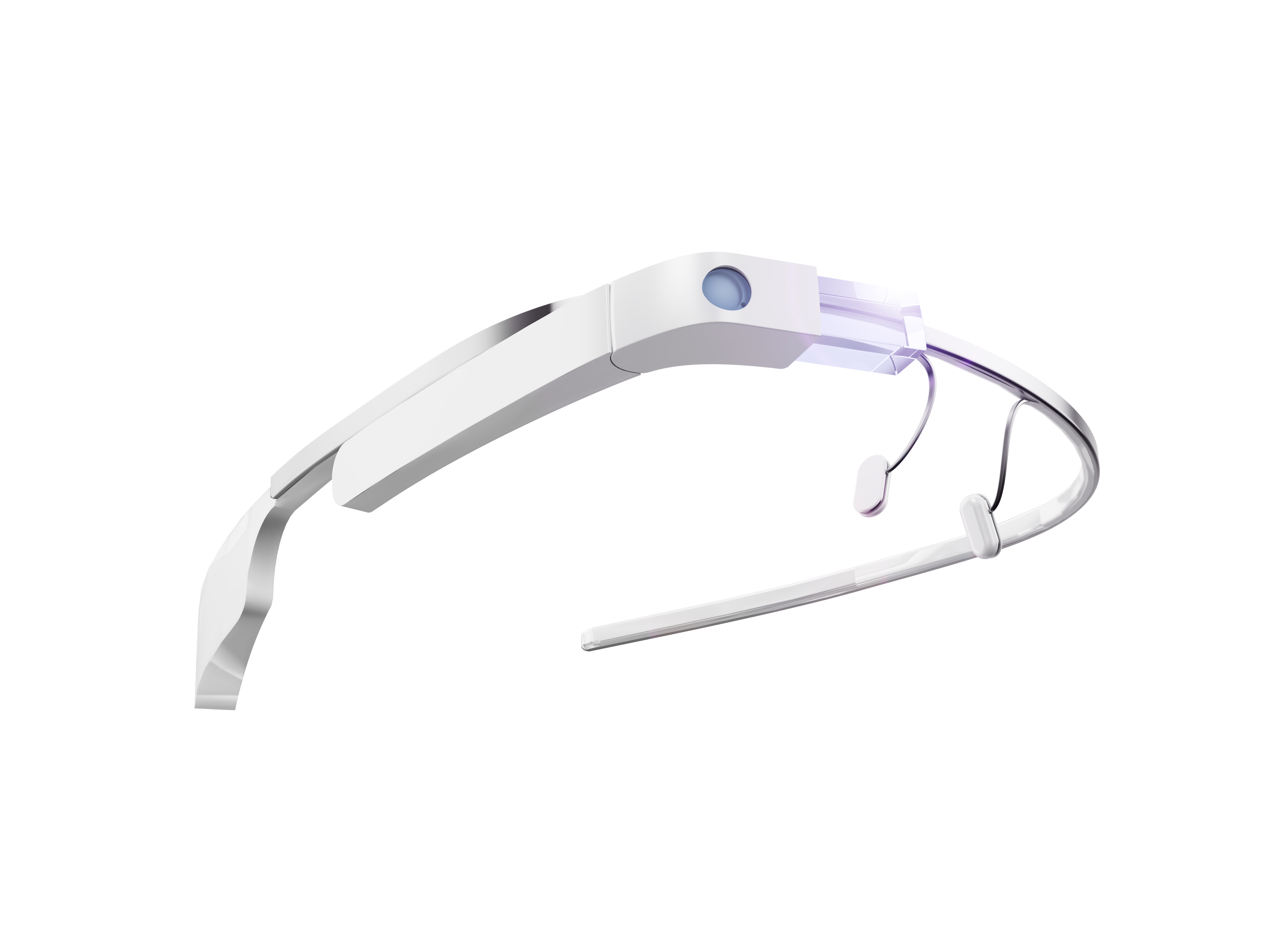
User Case Study
Having the Glass project be utilized for accessibility purposes would require understanding the needs of the person who will use it. Once those needs are acknowledged, the UI would be designed for the user’s needs.
What makes this a different project from the other projects I did is that I am designing for a wearable device. This is also a personal one as well, as I am a deaf person.
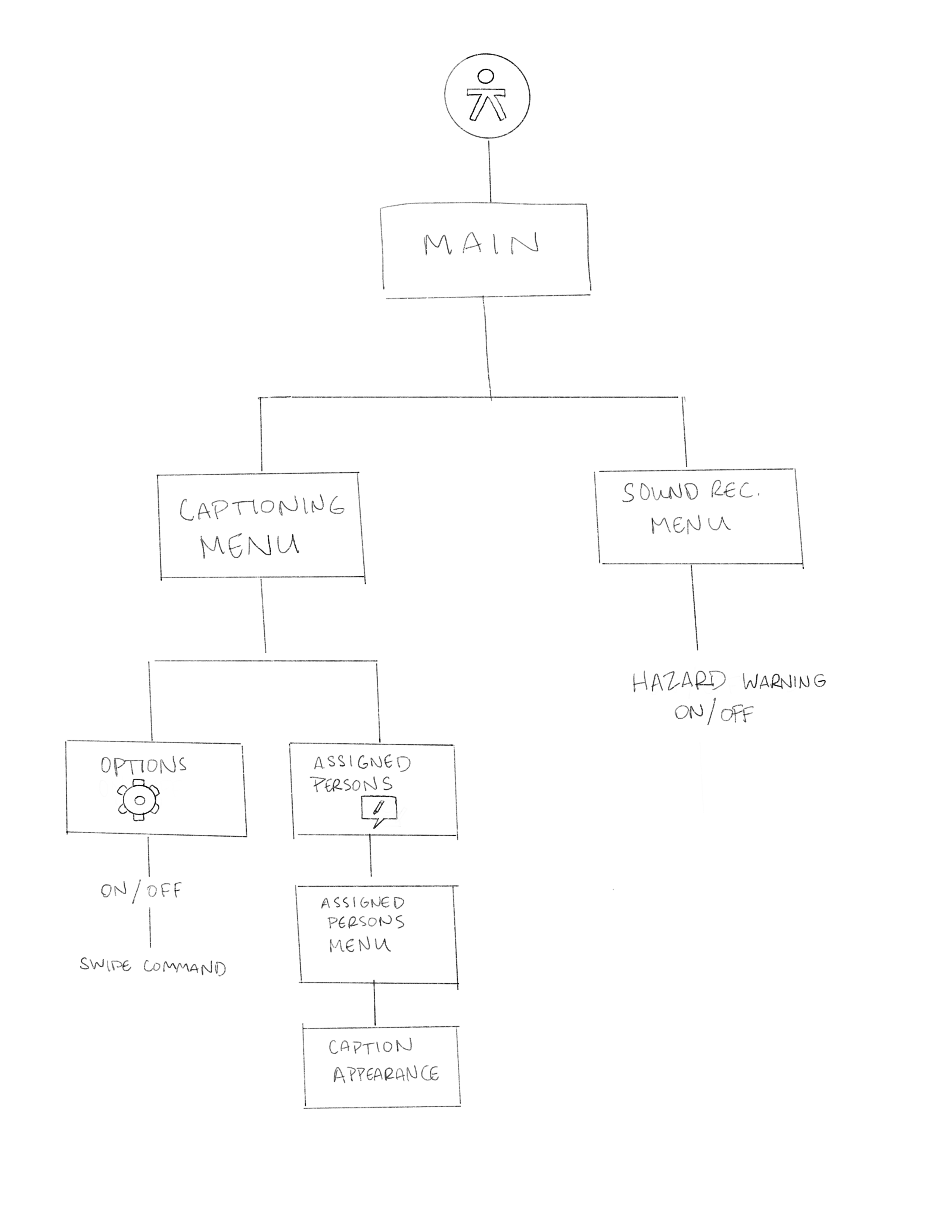
First User Flow Sketch
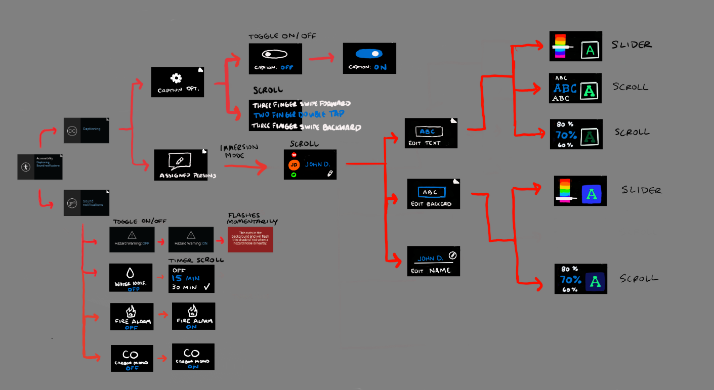
Second User Flow Sketch
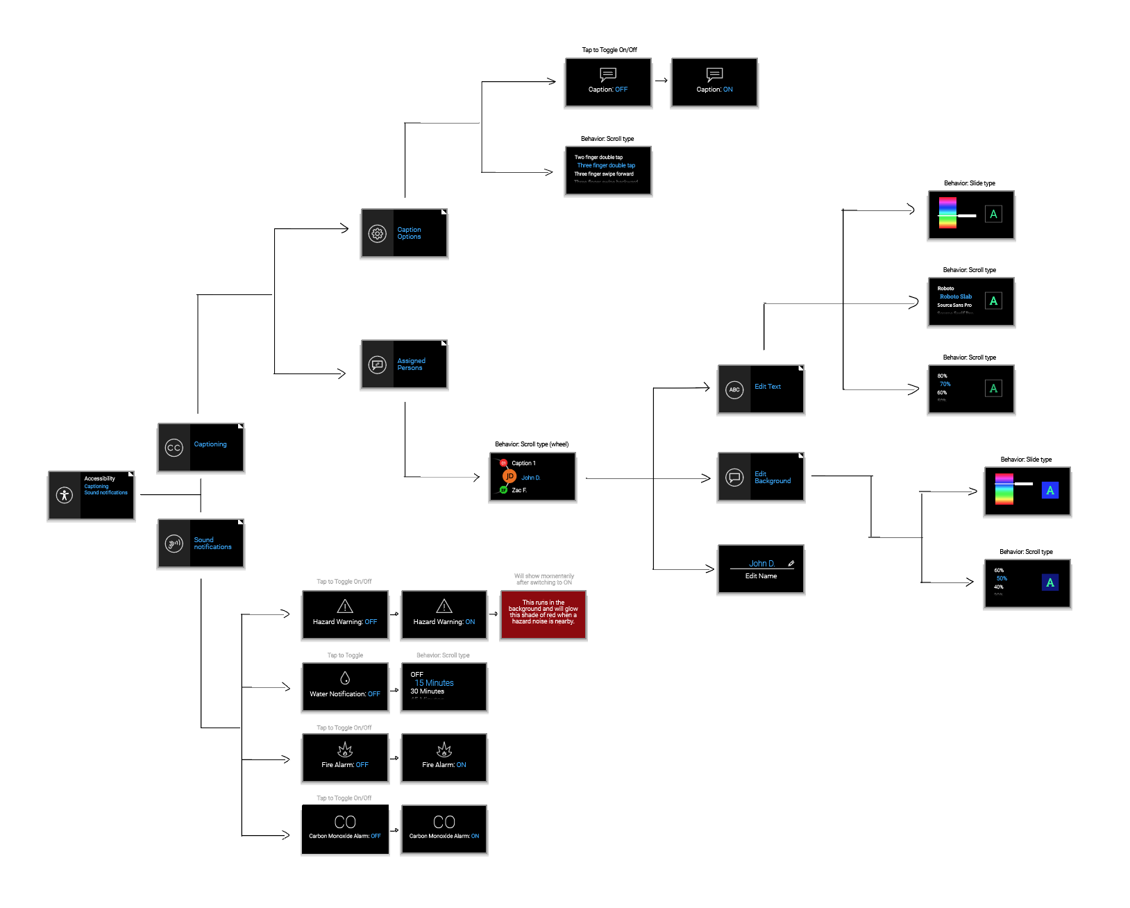
Final User Flow Sketch
Timeline Cards
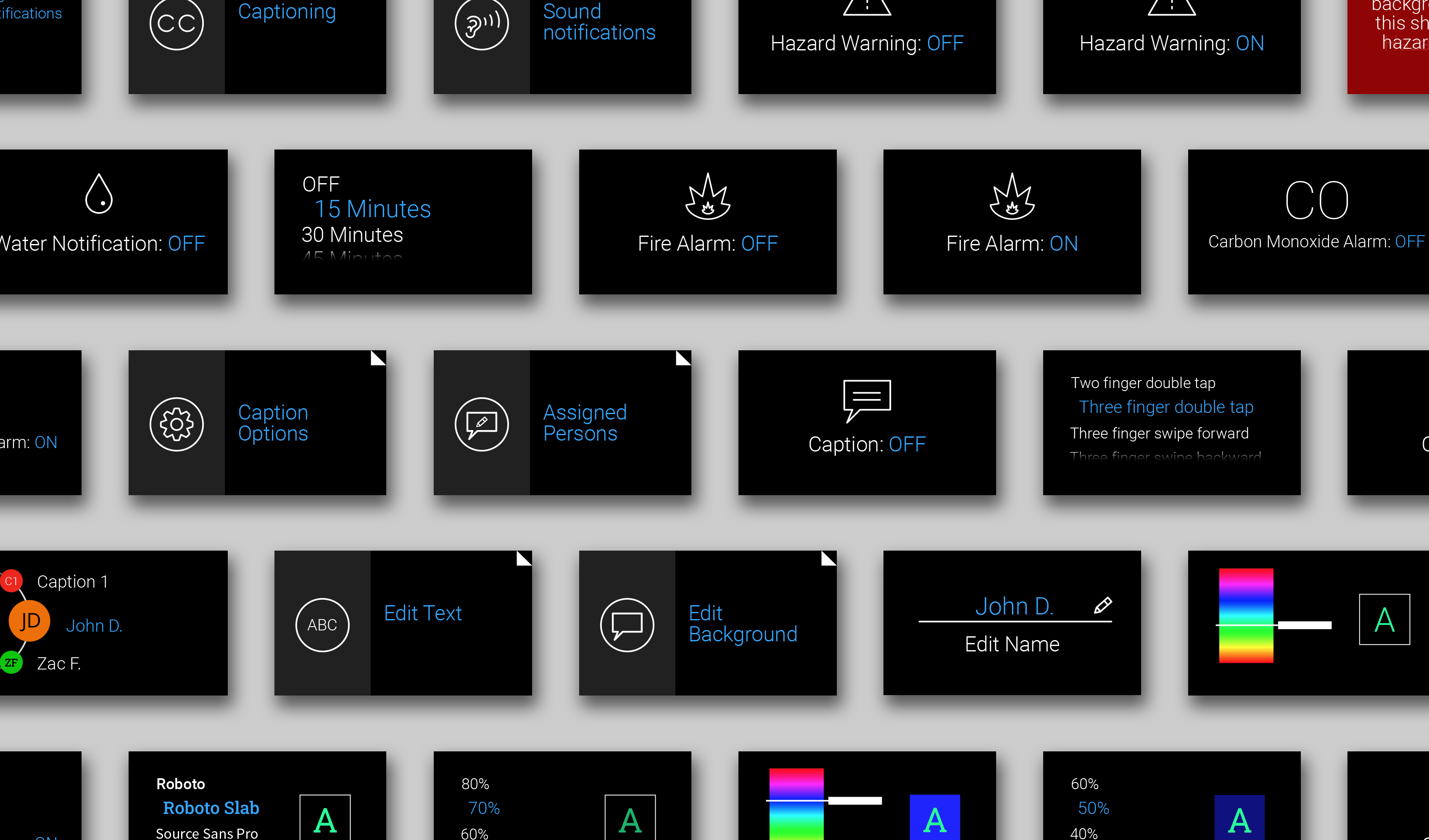
User Interface Design: Captioning

Using Google’s built-in Live Transcribe, captions are transcribed in real time.

User scrolls to search for a caption and Add icon shows up. Caption selected is enlarged and highlighted in blue.
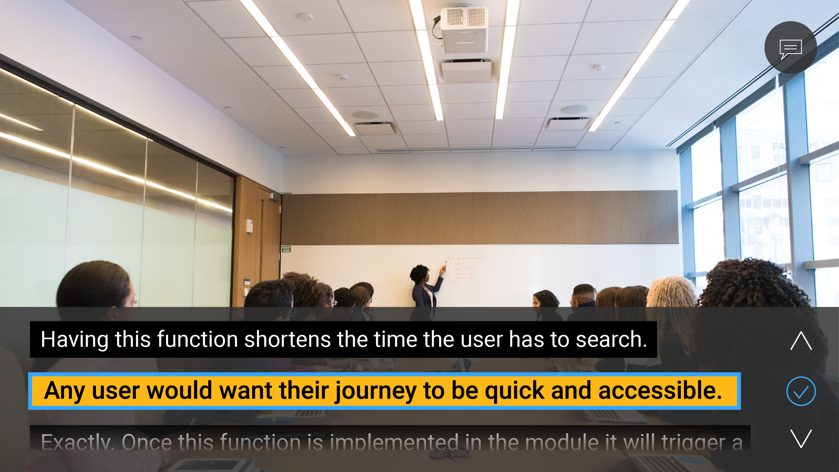
Once user taps to add the new voice, the Add icon briefly becomes blue with a check for confirmation. User can edit the caption and name the person later.
*Captions can be turned on or off with a custom tap or swipe command in the Accessibility menu.
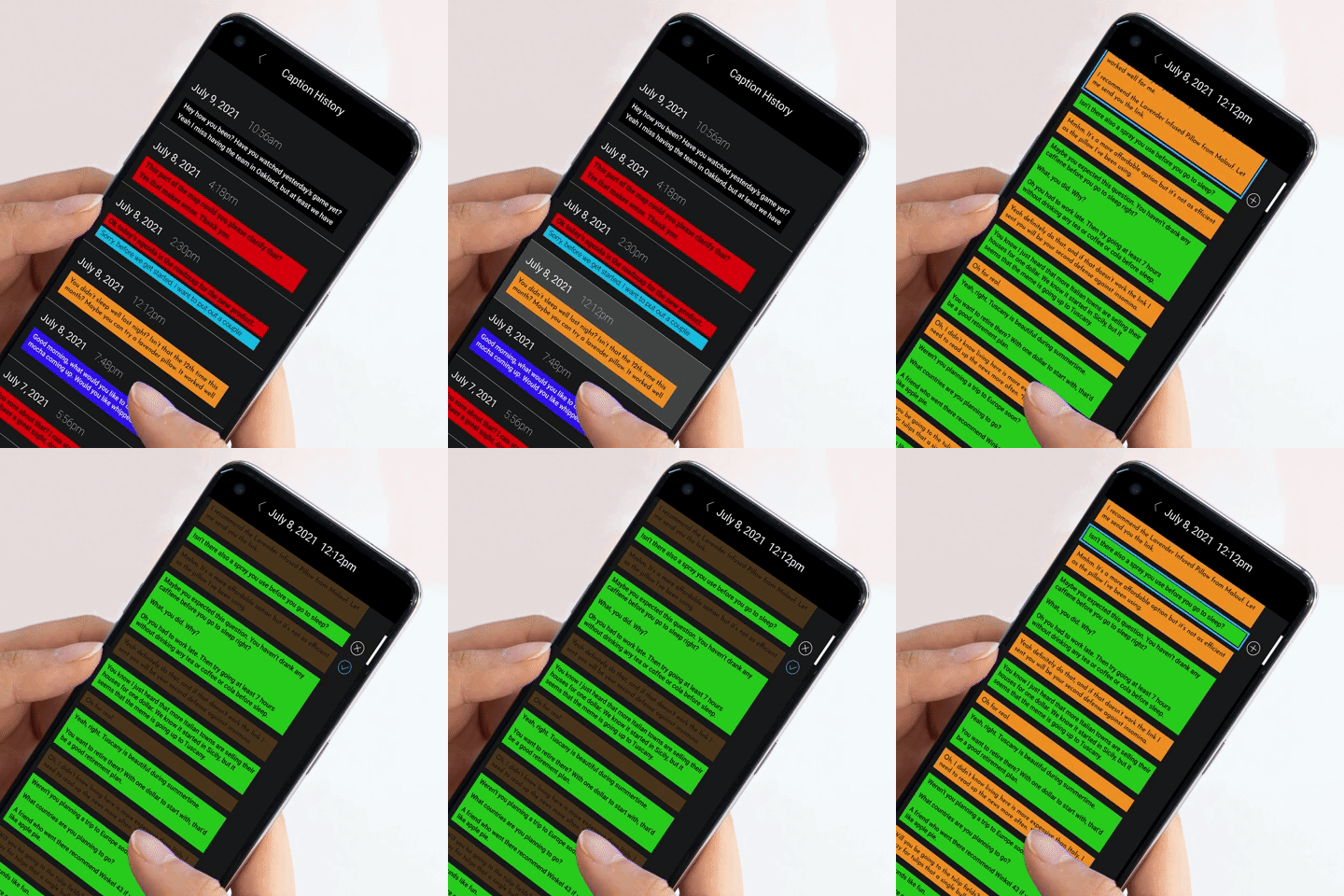
User Interface Design: Caption History (Mobile)
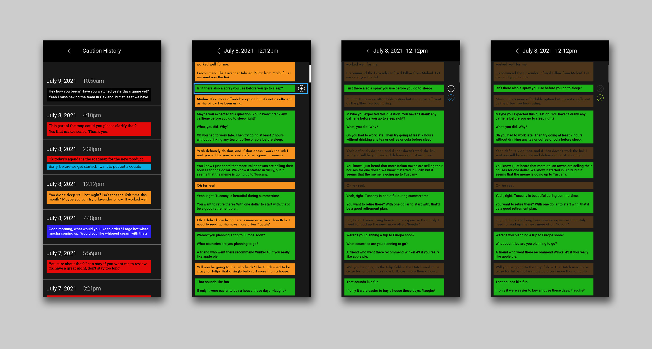
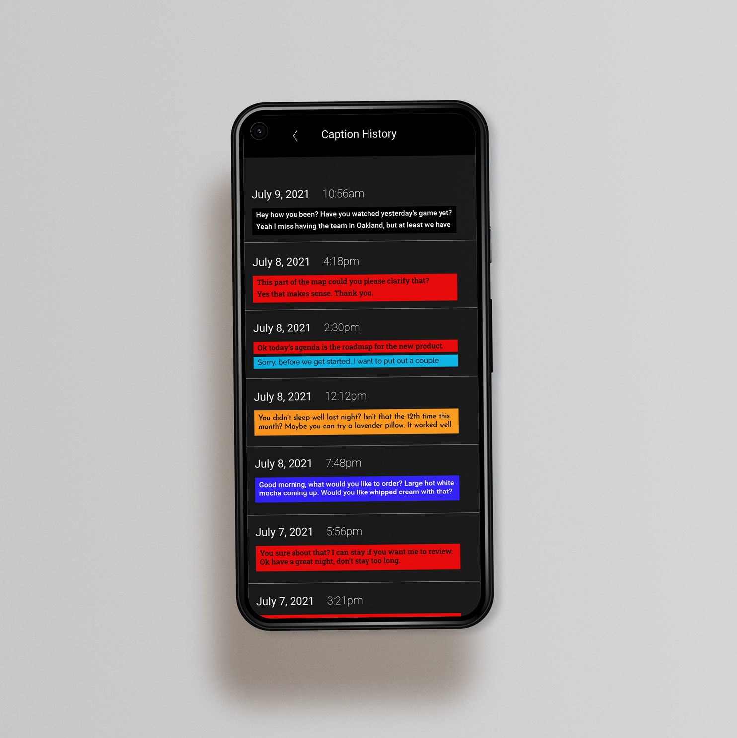
Glass may not have the storage capacity to keep history of all the captions that happened while Glass is in use. The captions, however, can be accessed through the mobile phone with an app that connects to Glass. Captions can be added to the Glass caption option as well.
User Interface Design: Sound Notification

Water notification glows once set timer reaches zero.

Fire icon glows when fire alarm triggers it.

Carbon monoxide icon glows when carbon monoxide alarm triggers it.
User Interface Design: Hazard Warning

When hazard warning is on, it is idle in the background until triggered by certain noises. Once triggered, the rectangle glows red in the top-right corner and indicates which direction it points to as a glowing white segment separating from the circle.
