Red Dragon
Red Dragon is a hot-sauce brand on a mission to revolutionize the hot-sauce industry by using locally sourced ingredients that pack real flavor and heat into their products. Their philosophy is to keep it simple without any compromise on flavor or heat factor.
This brand is directed at young adults who are foodies, more specifically Millennials and after. These generations first-hand are currently going through a food and health revolution with which a lot of options are more available than before. There is also a major shift in understanding where our food comes from and increasing support for local organic farms.


Logo Process
Using the red color of the chilis and the dragon to show the heat factor, many different versions of the logo were made before arriving at the final.
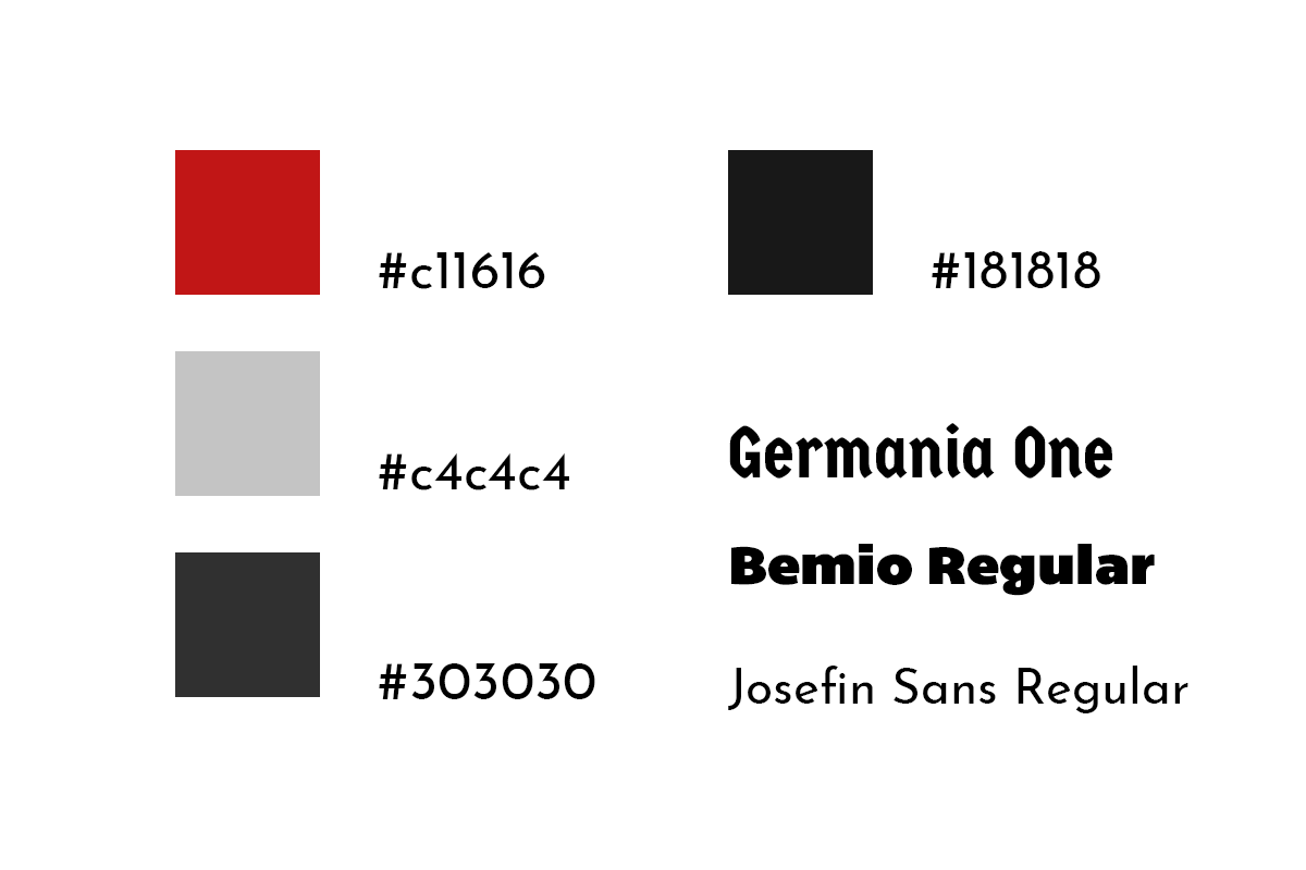
Someone suggested to add a shield behind the dragon to add better contrast. With the shield behind it, more experimentations were made until the essence of the brand is captured. After choosing the most dynamic and detailed logo, I sampled the colors and tweaked the head, neck and wing to fit the center of the bottle.


User Case Study
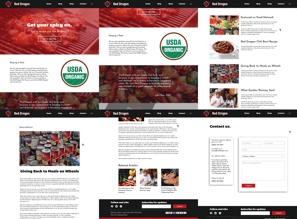
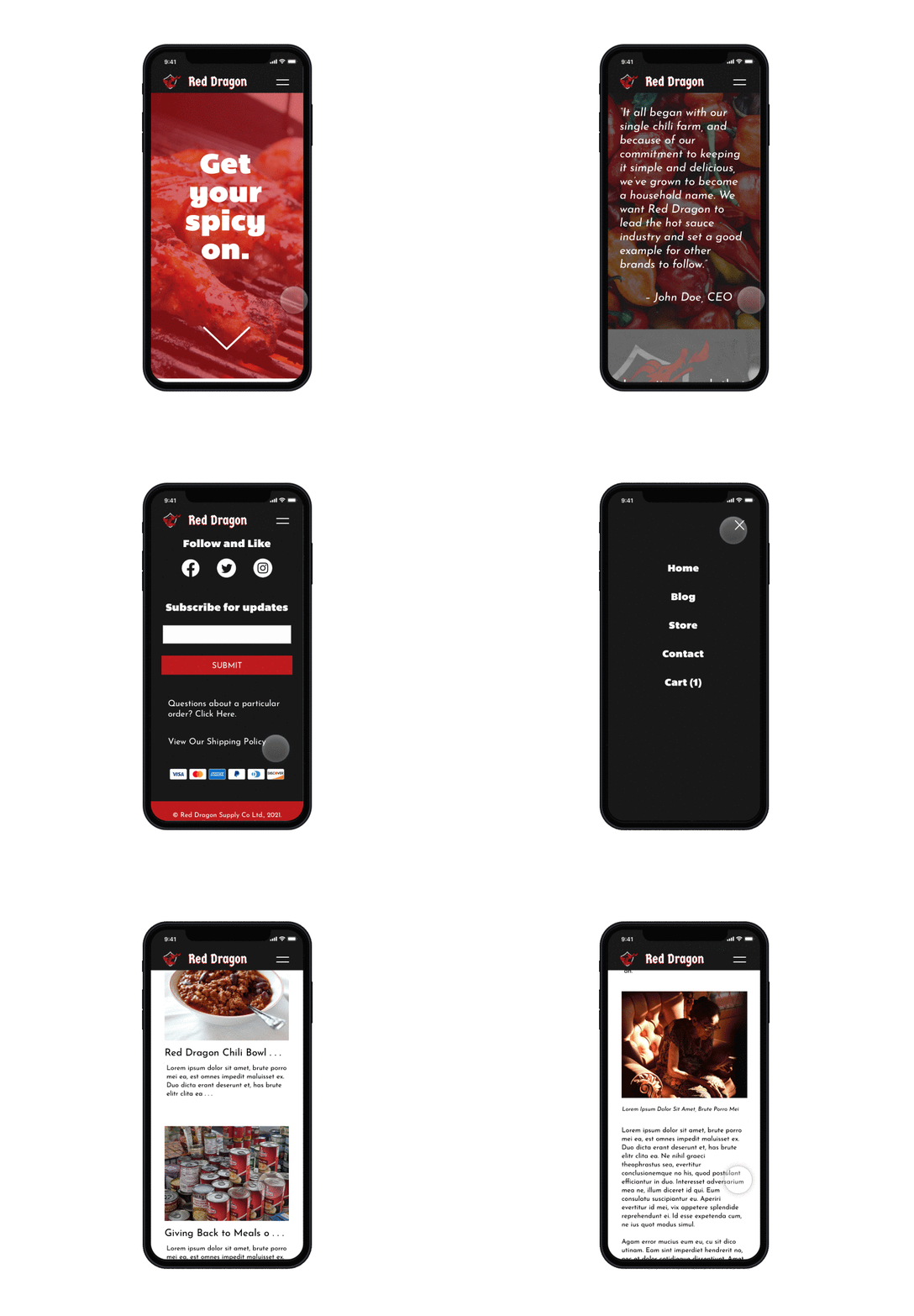
Having a website is central to the brand awareness of a product, where it can share information to consumers about the product's background. From my experience being with people who are foodies, they tend to look up food blogs or search recipes online on their time.
The idea for the website is that it will have to have a blog and online store to draw in devoted foodies and keep them returning. However, the major selling point will be the blog because users can send in their recipe on the blog to share with others.

